Color Palette by Image

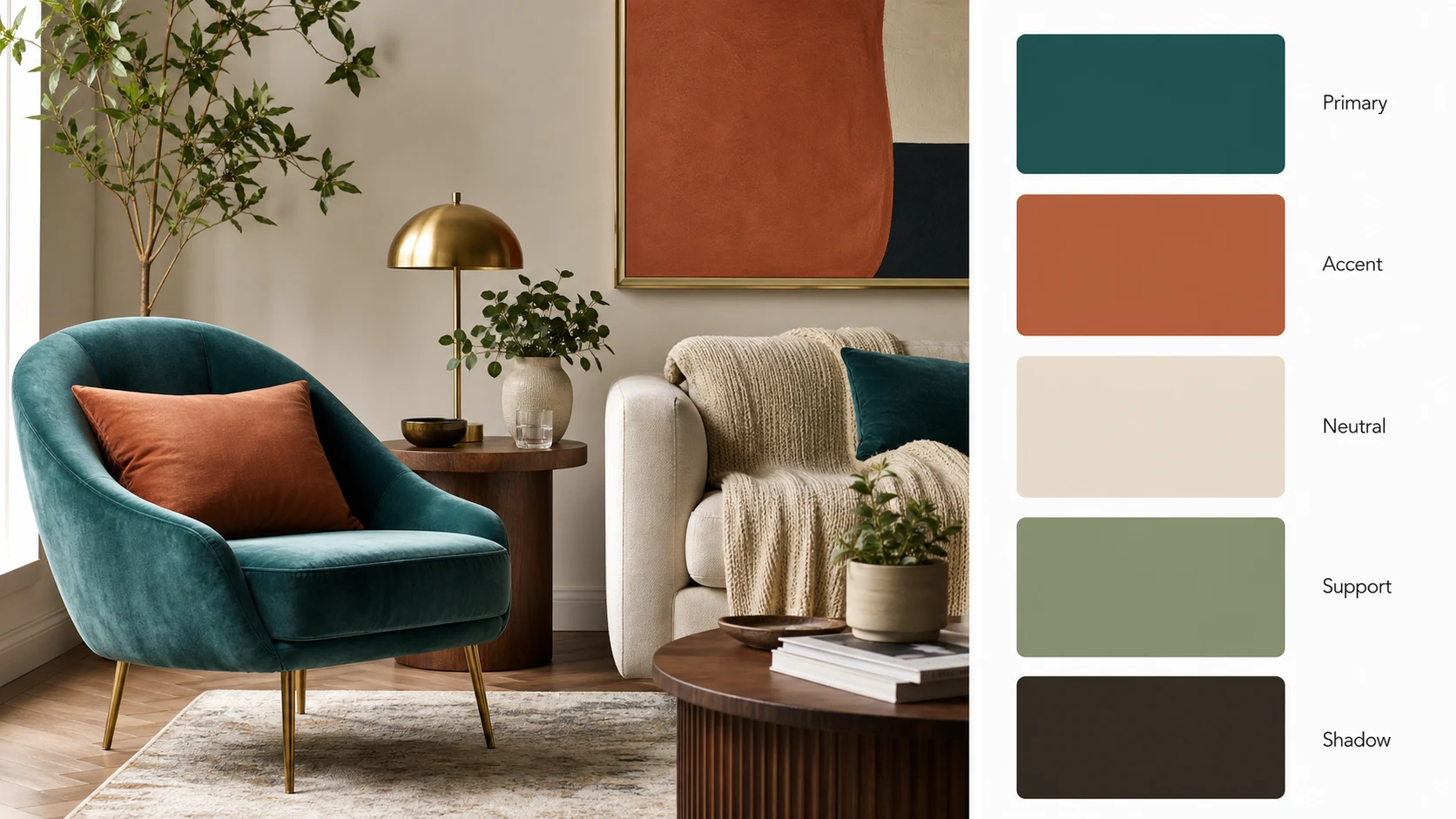
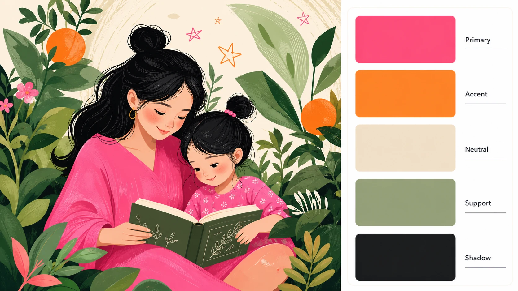
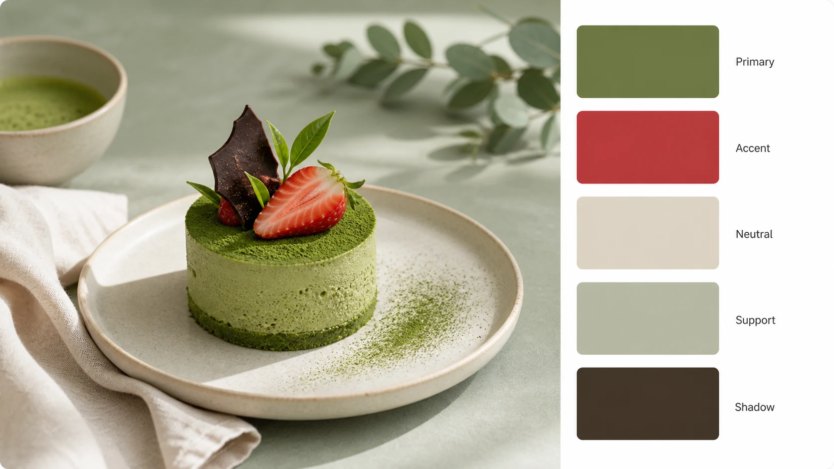
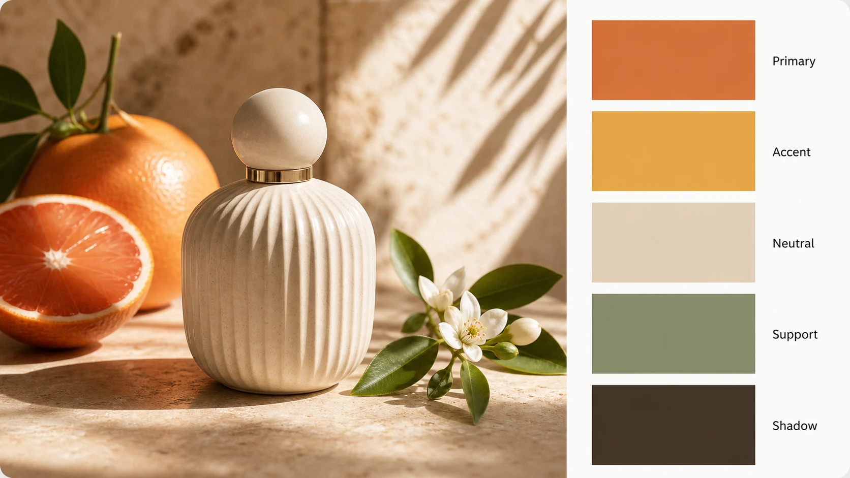
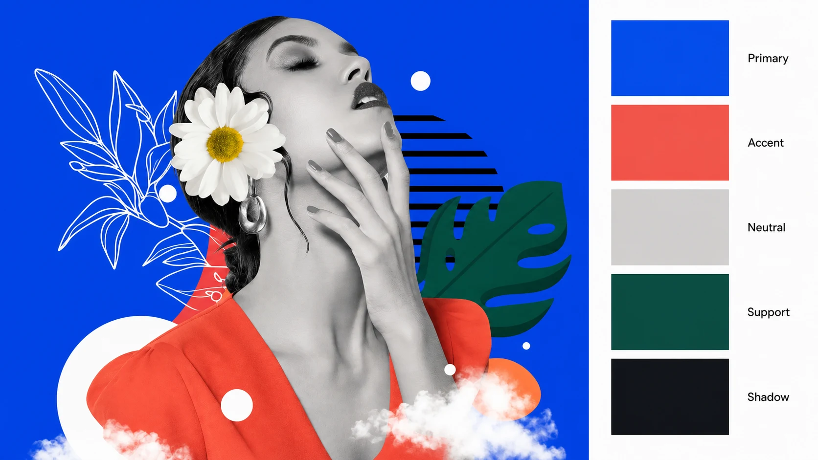
Upload a photo, artwork, product shot, UI screenshot, or interior image, then use color palette by image to turn it into a polished designer report. The result keeps the uploaded image as the main visual reference and places a clean palette card on the right side with five large swatches labeled by practical roles such as Primary, Accent, Neutral, Support, and Shadow.

Create a color palette by image without pretending to return exact values

Pvid's color palette by image workflow is built for visual planning, not fake precision. Many palette tools promise exact color values, but AI-generated text inside an image can drift. This page takes a more reliable route: upload a reference, generate a polished report image, and receive five large color swatches with useful design roles. The color palette by image result works as a mood board, creative brief, social share, brand exploration, UI direction, or quick visual reference when you need the colors to look coherent before you move into final production tools.

Color palette by image example using a fashion portrait with five large role labeled swatches on the right side

Image Upload

Turn any reference image into a palette report

Use color palette by image when a photo, product shot, illustration, fashion editorial, packaging image, room photo, or UI screenshot already has the mood you want. Instead of writing a color brief from scratch, upload the image and let the AI compose a designer-friendly report. The original image stays visible, so the palette never floats away from its source. The right-side card gives you five strong swatches that summarize the image in a format that is easier to show to a client, teammate, or creative collaborator.

Upload imageVisual sourcePalette card
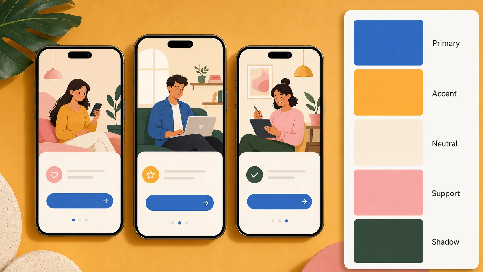
Color palette by image example for a UI moodboard with five role labeled swatches and no numeric color values

Design Roles

Use role labels instead of fragile color codes

A good color palette by image output should help you think like a designer. Primary can anchor the layout, Accent can create energy, Neutral can make the design breathable, Support can extend the system, and Shadow can guide depth or contrast. These role labels are more useful for early creative direction than unreliable text values drawn inside an AI image. When you need final production codes, use the report as a visual guide and sample colors in a dedicated design tool afterward.

PrimaryAccentNeutral
Color palette by image example using product packaging with a clean five swatch palette report

Creative Brief

Make palette images that are easy to share

Color direction is easier to approve when it is visual. The color palette by image output gives you one downloadable image that combines the source reference and the palette in the same frame. That makes it useful for brand workshops, social content planning, product packaging, interior mood boards, art direction, and quick UI explorations. Instead of sending a loose screenshot plus a separate list of colors, send one clear palette report that explains the relationship between image and swatches at a glance.

Shareable reportMood boardCreative review
Workflow

How to use color palette by image

The color palette by image workflow is simple: bring a useful reference, ask for a clean report, and keep the output focused on visual swatches instead of exact text values. Clear input images produce cleaner palettes.

1

Upload a clear image

Choose a photo, illustration, UI screen, product mockup, interior image, or artwork with the mood you want. Color palette by image works best when the main colors are visible and not buried under heavy blur or extreme filters.

2

Keep the report format specific

Ask for the uploaded image to remain as the main reference and for the palette card to sit on the right side. That gives the color palette by image output a consistent report layout that feels intentional and easy to compare.

3

Use role labels for swatches

Request Primary, Accent, Neutral, Support, and Shadow labels. These names tell you how the palette might function in a design system, brand board, poster, room concept, social graphic, or UI direction.

4

Download and refine

Save the color palette by image report as a visual brief. If you need production color codes later, sample the swatches manually in your design app and adjust contrast, accessibility, and brand rules there.

Color palette by image prompt ideas

These prompt directions show how color palette by image can support different creative jobs while keeping the same approved output rule: uploaded image first, right-side palette card, five swatches, role labels only, and no exact color values.

Color Palette by Image FAQ

Common questions about using color palette by image, uploading references, avoiding inaccurate color values, no login trials, no sign up workflows, and using palette reports in design projects.


Create your color palette by image report

Upload a reference image and turn it into a clean color palette by image report with five visual swatches, practical role labels, and a polished layout you can save or share.

Generate palette report